Talk:
Text and Type
with Tobias Frere-Jones
Tobias Frere-Jones will look at the mechanics of reading, and how he repurposed a centuries-old solution to improve on-screen legibility.
Whether it’s a few words in an interface or a thousand words in a blog post, we read words on screens over and over each day. But even with advances in resolution, screens can still hinder us in recognizing and interpreting letters. Frere-Jones has spent decades studying type history and working with today’s rasterizing technology. He found a strategy—commonplace for hundreds of years—that could be applied to this new challenge, and help our eyes and brains in a pixel environment.
He will present a case study of a recent type design project applying these renewed strategies to improve legibility.
This talk took place Friday, June 17, 2016, at 10:30am as part of the main Typographics conference schedule.
About Tobias Frere-Jones
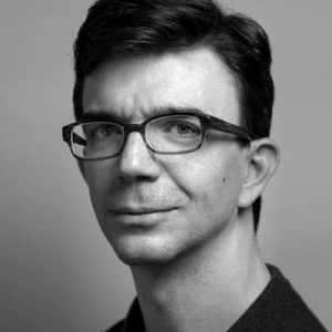
Over 25 years, Tobias Frere-Jones has established himself as one of the world’s leading typeface designers, creating some of the world’s most widely used typefaces, including Interstate, Poynter Oldstyle, Whitney, Gotham, Surveyor, Tungsten and Retina.
Frere-Jones received a BFA in Graphic Design from the Rhode Island School of Design in 1992. He joined the faculty of the Yale University School of Art in 1996 and has lectured throughout the United States, Europe and Australia. His work is in the permanent collections of the Victoria & Albert Museum in London and the Museum of Modern Art in New York. In 2006, The Royal Academy of Visual Arts in The Hague (KABK) awarded him the Gerrit Noordzij Prijs, for his contributions to typographic design, writing and education. In 2013 he received the AIGA Medal, in recognition of exceptional achievements in the field of design. Tobias launched his new type design practice, Frere-Jones Type, in January 2015.
Stay updated
Get the latest news and announcements in your inbox or feed.